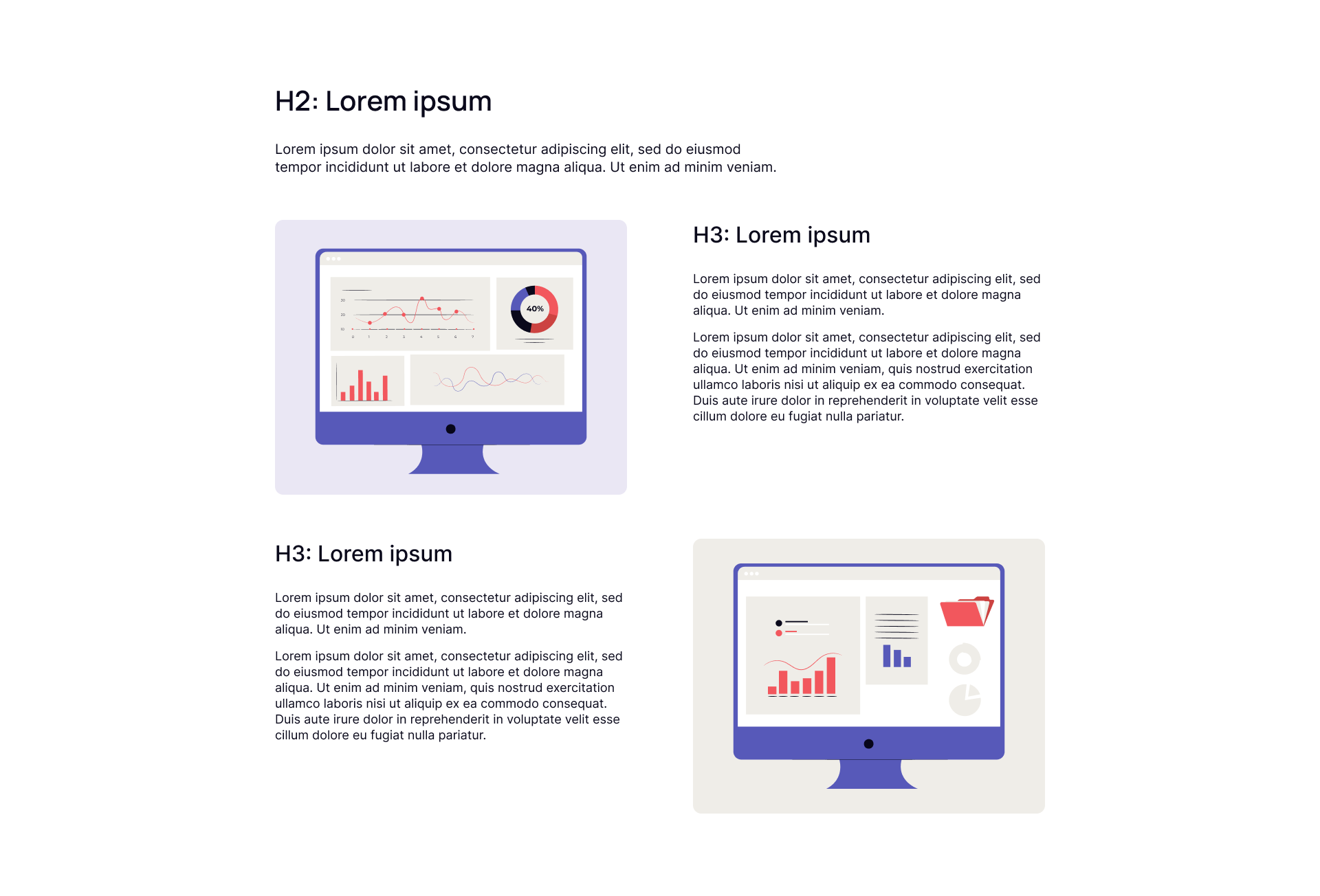
This module is designed to offer a dynamic and visually engaging two-section layout with alternating image and text positions.
First of all, the block contains a place for the title (H2) and a short description. Below, first section features an image on the left side paired with a heading (H3) and explanatory text on the right. The second section flips the layout, placing the image on the right with a heading (H3) and text on the left. This alternating pattern creates balance and keeps the viewer’s interest as they scroll.
Now you can see how this block will look in the desktop version.